uni's digital archive
Times New Roman: The Invisible Typeface
The Strange Legacy Behind the World's Most Famous Font
from 04/20/2025, by uni — 17m read
The Times
I have two weeks until I graduate from university, and just a few assignments stand between me and finals. Lately, what's been lingering in the back of my mind isn't coursework, it's fonts. Specifically, how since we were kids, we've been told to write everything in one of two sacred typefaces: Arial or Times New Roman. (I'll give a nod to Computer Modern too, the darling of LaTeX users in academia.) Teachers and professors have drilled it into us for years: "Use Times New Roman, 12-point font." But why? Why that font?
What even is Times New Roman? The name implies a few things: something formal, something rooted in history, "Roman" carries the weight of classical authority. "New" implies a refinement, a modernizing. And "Times"? Most assume it's tied to The New York Times or Time Magazine. But no, the font's origins trace back to The Times, a British newspaper founded in 1785. And this is where the real story begins.
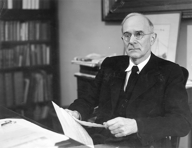 Figure 1: Portrait photo of Stanley Morison (~1960)
Stanley Morison was born in 1889 and fell in love with typography and the printing arts early on. Raised in poverty, he couldn't afford formal schooling, but he carved a path into publishing through sheer determination, landing an early role at The Imprint magazine. However, that opportunity didn't last long. In 1914, as Europe plunged into war, Morison was imprisoned for two years as a conscientious objector. After his release, he climbed steadily through the ranks of British publishing, working as a designer, editor, consultant, and essayist, a rare blend of scholar and practitioner.
His persistence eventually led to a position at Monotype, one of the two major typesetting firms of the era (the other being Linotype). There, Morison established himself as a leading voice in typographic history and revival. He became known for reviving and adapting historic typefaces, bringing Renaissance-era fonts like Poliphilus (1923), Blado (1923), and later Bembo (1928) into the machine composition era. Through a combination of deep historical knowledge and sharp aesthetic judgment, Morison helped shape the very standards of what clean printing looked like.
Over time, Morison became one of the most respected authorities on typographic and newspaper design. In the late 1920s, he began working closely with The Times as a typographic adviser. There's a persistent myth online that he landed the role by writing a "blistering article" in 1929 criticizing the paper's then-current typeface, likely Monotype Modern, as clunky and outdated. But this article doesn't seem to exist.
What actually happened was more delicate. Edmund Hopkinson of The Times reached out to Monotype to inquire about purchasing a full-page ad, similar to one they had run in 1912. When Monotype's managing director William Isaac Burch asked Morison for his thoughts, he replied, somewhat dramatically, that he'd rather pay The Times £1,000 not to run a Monotype ad. His critique was sharp and pointed: The Times was poorly typeset, and its typography undercut its authority.
Hopkinson relayed Morison's comments to William Lints-Smith, the paper's manager, who met with Morison in person. Rather than taking offense, Lints-Smith invited him to formalize his critique, and eventually offered him a role as typographic adviser. Morison accepted. What followed was not just a redesign, but a full typographic reform of The Times.
On November 26, 1930, Morison submitted a 34-page report titled Memorandum on a Proposal to Revise the Typography of The Times. In essence, it was a crash course in typography. Morison argued that the paper's authority and prestige were being undermined by its use of a mixture of dated Caslon styles. These fonts didn't showcase the print quality of the paper, nor did they reflect the balance between tradition and modernity that The Times prided itself on. Morison proposed a new design philosophy, one that would allow the paper to look as serious and modern as it read.
"The question of an ideal type is, indeed, one of the greatest difficulty, complexity, and risk for any newspaper." - Stanley Morison
The Polymath
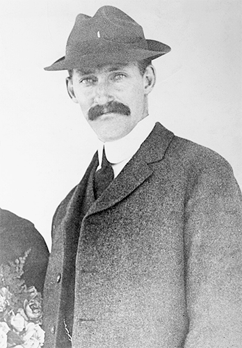 Figure 2: Photograph of William Starling Burgess (~1910)
William Starling Burgess was a rare kind of mind, the sort that seems like it belongs to another era entirely. Born in 1878 into a prominent Boston shipbuilding family, Burgess quickly distinguished himself as one of the great American yacht designers of the 20th century. His sleek, innovative vessels went on to win the America's Cup multiple times, etching his name into maritime history. But he wasn't merely a builder of boats. Burgess's talents extended skyward: in the early 1900s, he helped design some of the earliest military aircraft, including models built under license from the Wright brothers. He was part engineer, part artist, and fully a polymath, restless, curious, and drawn to any field that promised elegance and invention.
While most men of his time specialized, Burgess veered across disciplines: yachts, biplanes, hydrofoils, communications theory, patents. His mind refused to settle. According to Gerald Giampa, a Canadian typographer who later acquired the U.S. Lanston Monotype Machine Company in 1983, Burgess may have even dabbled in typography. Giampa claimed to have discovered correspondence from 1904 between Burgess and Lanston Monotype, in which Burgess submitted drawings for a custom typeface intended for use at his shipyard. The type was never used. After partnering with Augustus Moore Herring to form the Herring-Burgess Company, and receiving a license to produce Wright aircraft, Burgess abandoned the project. But according to Giampa, the drawings were preserved by Lanston, quietly archived and labeled as "Number 54."
Meanwhile, back in London, Stanley Morison had begun working with Victor Lardent, a draftsman from The Times advertising department, to conceptualize a new typeface for the newspaper. Their goals were straightforward: maximize space (more words per line, more lines per page) and improve readability. At the time, The Times used a heavy, outdated serif that consumed ink and tired the reader's eyes. Morison envisioned a typeface that would be both economical to print and effortless to read, a balance of precision and utility.
Accounts of their working process diverge. Morison later claimed that he sketched a prototype in pencil and handed it directly to Lardent. But Lardent remembered it differently. According to him, Morison gave him a photographic reproduction of Monotype's Plantin as the basis, and asked him to modify it. Plantin, a revival of a 16th-century type by Robert Granjon, had been adapted for modern use by Frank Hinman Pierpont, Monotype's engineering manager. Pierpont had overseen the revival in the 1910s after acquiring original cuts from the Plantin-Moretus Museum in Antwerp. His involvement in this earlier project is well documented, and crucial to the theories that followed.
Because here's where the story starts to fray. The Morison–Lardent version of events, while messy, is still coherent. But Mike Parker, a close friend of Giampa and former director of typographic development at Linotype, suggested that Pierpont may have provided Morison with the shelved design of Number 54. Though Parker couldn't prove how this happened, the implication was clear: Times New Roman may not have been designed from scratch at all. If Pierpont had access to the Lanston pattern archives, which is plausible, he could have passed the design to Morison, who then adapted it without ever revealing its true source.
"It has the merit of not looking as if it had been designed by somebody in particular" - Stanley Morison
In hindsight, this quote feels less like modesty and more like sleight of hand, the kind of remark a man makes when he has something to hide, or something to protect.
A Typeface Unleashed
By April 1931, the first cut of Times New Roman had been completed, a 9-point size tailored for newspaper printing. Monotype went on to develop a full suite of 38 fonts in the family, refining the typeface across sizes and weights. It officially debuted in the Monday edition of The Times on October 3rd, 1932, accompanied by public fanfare. It marked a historic moment: the first time a newspaper had commissioned and adopted a typeface of its own. For one year, The Times held exclusive rights to its use.
During that brief window, Times New Roman gave The Times a distinctive visual identity, clean, authoritative, and modern. But the real success came in 1933, when the typeface was released into the wider market. Monotype began offering it to other publications and printers, and it proved to be remarkably adaptable: suitable not just for newspapers, but for books, magazines, and academic work. Its balanced proportions, economical spacing, and clear readability made it a typographic workhorse.
In the decades that followed, Times New Roman would eclipse its origins, becoming something far larger than a house font for a London newspaper. It's now a global typographic standard, a brand unto itself, instantly recognizable across documents, textbooks, and screens. Today, it's not just associated with The Times; in many ways, it has outgrown it entirely.
Operating Systems
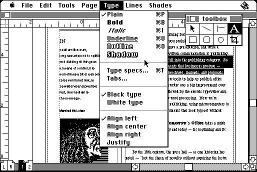 Figure 3: Screenshot of Aldus PageMaker desktop publishing software (1987)
The early era of personal computing was a strange, pixelated landscape. Screens were low-resolution, memory was tight, and fonts were little more than grids of static dots, bitmap fonts, laboriously crafted for each individual size. These fonts couldn't scale or adapt. A letter rendered at 12 points looked totally different from one at 18, and if you dared to enlarge them, they turned into a jagged mess of squares. Typography in this environment was functional at best, crude at worst.
That all changed with the arrival of PostScript in the mid-1980s, Adobe's page description language that allowed fonts to be defined as mathematical outlines using Bézier curves. For the first time, text could be scaled infinitely without distortion, printed with professional-level precision, and typeset beautifully from the comfort of a home office. This wasn't just a technical shift, it was the beginning of desktop publishing as we know it, and it paved the way for the global takeover of fonts like Times New Roman.
Apple was one of the first to seize this opportunity. Partnering with Adobe, it incorporated PostScript support into its LaserWriter printers and bundled its Macintosh computers with a core set of PostScript fonts. Among them was Times Roman, not Times New Roman, but a close cousin developed from the same lineage. Times Roman preserved the spacing and general silhouette of TNR but had subtle differences in proportion and detail. Apple users in the late '80s and early '90s typed away in Times Roman without giving it a second thought, it looked official, crisp, serious. That aesthetic took hold in the emerging desktop publishing ecosystem, especially in software like Aldus PageMaker, which allowed ordinary users to design newsletters, flyers, and academic papers with the typographic polish of a professional press. In essence, Apple helped normalize the look of Times New Roman even before it arrived by name.
But it was Microsoft that finished the job. In 1992, with the release of Windows 3.1, Microsoft licensed Times New Roman directly from Monotype and installed it as one of the system's core TrueType fonts, the default in Microsoft Word, Excel, and countless other programs. If Apple helped aestheticize the font, Microsoft institutionalized it. TNR became the baseline, the zero point, the font you had to consciously opt out of. Legal documents, school essays, business reports, all of them were poured into the narrow columns of a typeface originally designed for a London newspaper in the 1930s. By the late 1990s, Times New Roman was the most used typeface in the world, not because people loved it, but because it came with everything. Its authority wasn't aesthetic anymore, it was systemic. Through licensing deals, OS bundling, and software defaults, Microsoft made Times New Roman the typographic default setting of the digital age.
Coincidence?
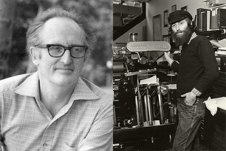 Figure 4: Left: Mike Parker (~1980) Right: Gerald Giampa (~1987)
The controversy over the origins of Times New Roman isn't just a question of design lineage, it's a story about authorship, erasure, and historical authority. On one side is the official version: that Stanley Morison oversaw the creation of the typeface in 1931, with Victor Lardent executing the drawings and Monotype engineering the production. It's clean, contained, and backed by documentation, or at least, by those still standing when the story was cemented. But the revisionist theory, championed by Mike Parker and Gerald Giampa, suggests something far messier: that the design existed decades earlier, in the hands of American polymath William Starling Burgess, and was shelved in a Monotype archive until Pierpont and Morison dusted it off. No direct evidence survives, but the pattern plate of a capital "B" and Parker's belief in the lost "Number 54" series offer just enough smoke to keep the question alive.
The timing of the controversy's reemergence is hard to ignore. Parker's theory was published in 1994, just two years after Microsoft bundled Times New Roman into Windows 3.1, making it the most widely used typeface on Earth. By then, the font had gone from historical curiosity to intellectual property goldmine, embedded in documents, operating systems, and entire institutions. If someone could reshape the origin story, even a little, they might not just rewrite history, but own a part of it. Parker and Giampa weren't passive observers. Giampa owned the remnants of Lanston Monotype, where the supposed Burgess designs were said to be stored. Parker, once a typographic director at Linotype, had long sought to challenge Morison's dominance in the narrative of typographic history. Their theory wasn't just a scholarly gesture, it was a counterclaim to power.
What makes the whole affair so compelling is how plausible it feels, and how conveniently unprovable it is. Fires, floods, and bombings destroyed key records in the exact locations and decades that mattered most. The primary figures are all dead. The surviving artifacts, the plate, the testimonies, are more evocative than conclusive. But in the absence of definitive proof, we're left with two myths, each crafted by men with something to gain. One frames Times New Roman as a triumph of British typographic heritage. The other reframes it as a forgotten American invention, buried, borrowed, and reborn under another man's name. Both stories are about design. But more than that, they're about who gets remembered, who gets erased, and who gets to decide what history looks like in print.
Conclusion
Times New Roman is an undeniable standard. It's one of those rare typefaces that no longer feels like a design choice, it simply is. Ubiquitous, default, quietly authoritative. It sits at the intersection of bureaucracy and academia, journalism and government, used so frequently and across so many contexts that we often forget it was ever designed at all. And yet, its endurance is proof that typography isn't just about aesthetics, it's about the systems that shape how we read, how we think, and how institutions present truth. Fonts have power. If they didn't, there wouldn't be so much debate over who created this one, or so much effort put into guarding the journalistic credibility of The Times through something as seemingly invisible as its typeface.
The story of Times New Roman is complex, convoluted, and strangely human. It's a story about ambition, invention, and conflicting narratives. It's about figures like Morison, Lardent, Pierpont, Burgess, Parker, and Giampa, men with vastly different talents and reputations, all somehow tangled in the history of this one font. Their contributions were shaped not just by skill, but by who got remembered, who got credit, and who had access to the archive. In that sense, the story of Times New Roman is about more than letters, it's about legacy and control, and how design history is written not just by what survives, but by who gets to tell the story. Despite the ambiguity, what's left behind is a typeface that works, one that has adapted across eras of technology, from hot metal to PostScript to the screens we stare at today.
In a couple of weeks, I'll graduate. I might never type in Times New Roman again. As a programmer, there's plenty of discourse about which font is best for code, JetBrains Mono, Fira Code, IBM Plex Mono, the list goes on. Everyone has their preferences, everyone argues kerning and ligatures. But even if I'm not the one using it, I know Times New Roman will still be everywhere around me, in resumes, book interiors, contracts, and academic journals. I'll see it in things that are meant to look official, serious, credible, things meant to last. And maybe that's what makes Times New Roman so fascinating after all: not that it's beautiful or beloved, but that it became part of the modern world without ever needing to ask for permission.
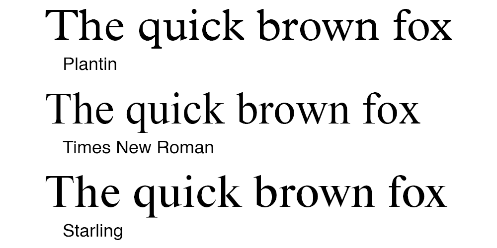 Figure 5: Comparison of the modern typefaces
In 2009 Mike Parker released the typeface Starling, which was allegedly based directly on the 1904 design of William Starling Burgess. You can download it here.